Adobe x Microsoft Partnership
Role
Lead Designer
Project
New User Experience
Overview
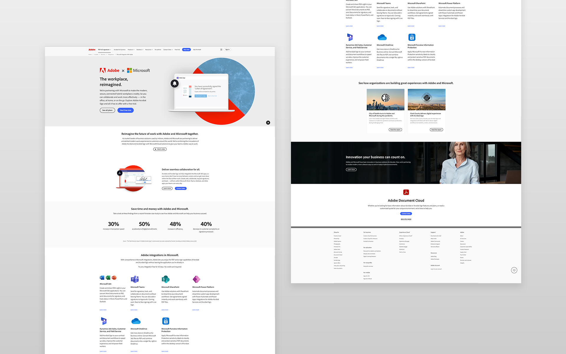
Adobe and Microsoft teamed up to provide seamless integration between Adobe Acrobat and Microsoft 365, offering users a more efficient and collaborative way to work with PDFs within Microsoft’s ecosystem. My role was to design a new dedicated partnership page that clearly communicated this integration, its benefits, and how users could get started. The page was shared via an email campaign to drive awareness and engagement.
Project goals
Clarify the Integration: Clearly explain how Adobe Acrobat and Microsoft 365 work together to enhance productivity and streamline document management.
Drive User Engagement: Encourage visitors to explore the partnership and learn more about how the integration could benefit their workflow.
Reduce Bounce Rate: Create a compelling and intuitive user experience that keeps visitors engaged and reduces the likelihood of bouncing after landing on the page.
Support Email Campaign: Ensure the page supports the email campaign by capturing user attention and encouraging further exploration.
Research & Approach
Discovery & Analysis
Before beginning the design, I conducted the following research to align the project with both user needs and business goals:
Stakeholder Interviews: I spoke with both the Acrobat partnership team to understand the core benefits, target audience, and key messaging for the page.
Content Review: I reviewed existing documentation on the integration and identified key features that users would find most valuable, such as in-app editing and seamless PDF sharing within Microsoft apps.
Competitive Analysis: I analyzed partnership pages from other tech companies to understand best practices for showcasing integrations in an informative yet engaging way.
User Personas
The page was designed with a specific audience in mind, including:
Business Professionals: Users looking to enhance productivity with Acrobat’s PDF tools directly within Microsoft Office apps (e.g., Word, Excel, Outlook).
IT Administrators: People responsible for managing software integrations within companies and organizations.
Adobe Acrobat Power Users: Existing Acrobat users who need a streamlined workflow with Microsoft apps for better document collaboration.
Hypothesis
We hypothesized that by creating a dedicated, clear, and informative partnership page, users would:
Gain a better understanding of the Acrobat and Microsoft integration.
Be more likely to engage with the page content and explore the integration further.
Have a lower bounce rate and spend more time exploring features.
Design Solutions
Clear and Simple Messaging
Action: We crafted clear, simple messaging that explained the benefits of the integration upfront. We addressed:
How Acrobat integrates directly with Microsoft 365.
Key features and workflows that make collaboration easier.
Clear calls to action (CTAs) for users to start exploring the integration.
Benefit: This provided visitors with easy-to-digest information, allowing them to quickly understand the value.
Visual Demonstrations & Use Cases
Action: To make the benefits more tangible, we incorporated visual elements like GIFs, screenshots, statistics, and simple use case scenarios showing Acrobat in action within Microsoft apps. Each use case demonstrated a real-world workflow, such as editing PDFs in Microsoft Word or using Acrobat tools in Outlook.
Benefit: Visuals helped make the integration feel more accessible and relatable, allowing users to quickly envision how it would fit into their daily tasks.
Strong CTAs and Easy Navigation
Action: I placed prominent and action-oriented CTAs throughout the page, such as "Learn More," "Get Started with Microsoft 365," and "See Acrobat in Action." Each CTA led users to relevant resources or product pages to guide them through the next steps.
Benefit: Clear CTAs made it easy for visitors to take action, whether they were looking for more information or ready to try the new integration.
Prototyping & Testing
I created wireframes & high-fidelity prototypes to conduct user testing to validate the layout, messaging, and interactive elements. We ran the following tests:
A/B Testing for CTA Placement: Testing different language and placement of the CTA buttons to determine which configuration led to higher responses.
Usability Testing: We tested with users who were not familiar with the Adobe-Microsoft integration to ensure that the page was easy to understand and navigate.
IMPACT
The new Adobe x Microsoft partnership page performed exceptionally well following the email campaign launch. Key metrics included:
High Click-Through Rate (CTR): The page had a significantly higher click rate compared to previous email campaigns.
Lower Bounce Rate: Visitors were less likely to bounce after landing on the page, showing that the content and messaging were engaging enough to keep users interested.
Increased Time on Page: Users spent more time exploring the content, indicating that they found the information valuable and were more likely to explore the integration in detail.