
Adobe Acrobat Teams
Role
Lead Designer
Project
Page Redesign
Overview
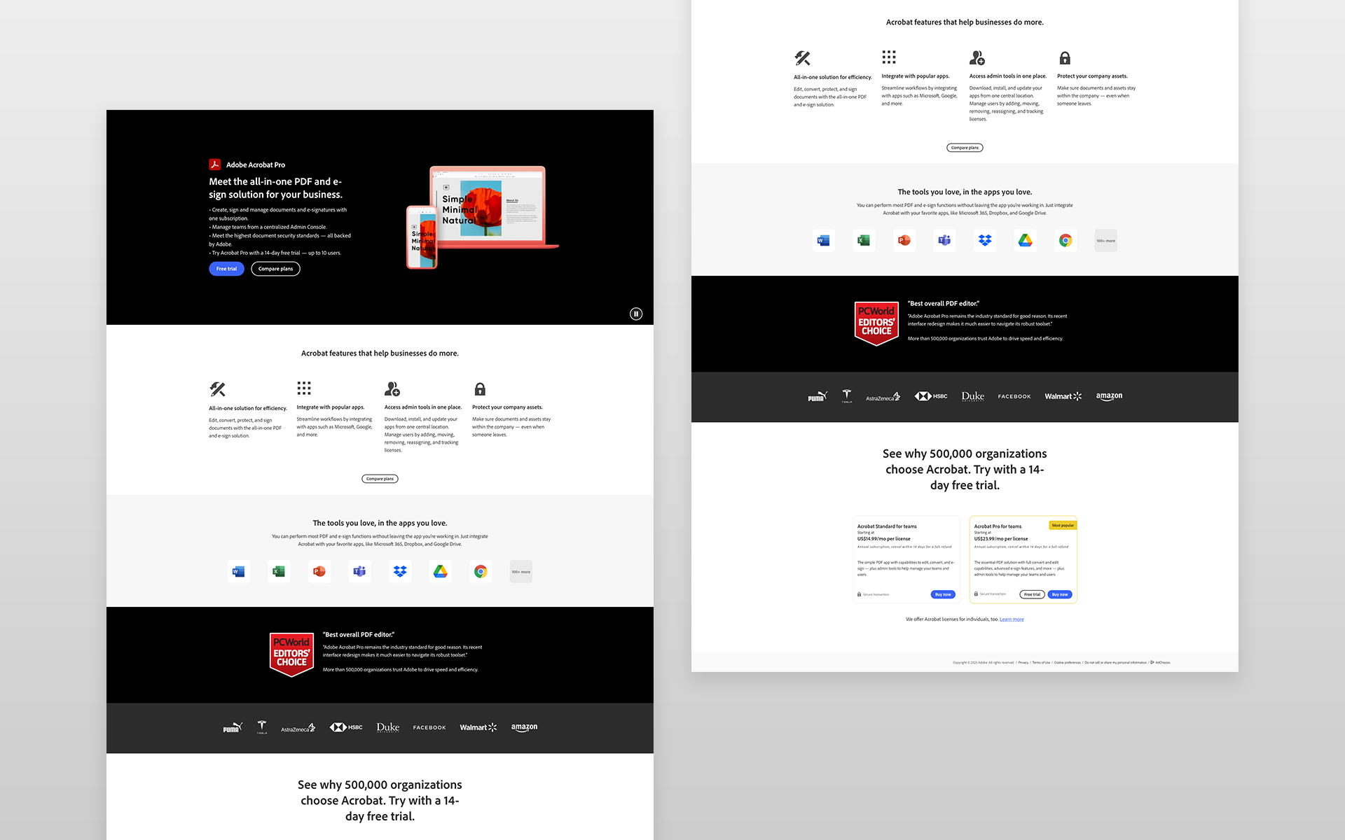
The Adobe Acrobat Teams product page was underperforming in terms of conversion rates and engagement. As part of the UX redesign, the goal was to create a more streamlined, user-friendly experience that would resonate with potential users while showcasing Adobe Acrobat Teams' value. By shortening the page, improving messaging, and adding features like a seat selector, we aimed to increase both conversions and revenue.
Project goals
Increase Conversion Rate: Improve the page’s effectiveness in turning visitors into customers by simplifying the content and enhancing key calls to action.
Highlight Key Plans: Merchandize the most popular Acrobat Teams plans to make it easier for users to understand their options and make purchasing decisions.
Optimize User Experience: Shorten the page for a quicker, more digestible experience, ensuring users can find relevant information quickly.
Introduce a Seat Selector: Add an interactive tool that allows users to select the number of seats they need, making it easier to customize their purchase.
Improve Messaging: Refine the messaging to be more concise, persuasive, and aligned with the needs of potential Acrobat Teams users.
Research & Approach
Discovery & Analysis
I started with a thorough analysis of the current Acrobat Teams page performance, which included:
Data Review: Reviewing analytics to identify where users were dropping off or getting stuck, as well as areas with high exit rates.
Stakeholder Interviews: Conducting interviews with internal stakeholders to understand business goals, user needs, and the most important features of Acrobat Teams to highlight.
Competitor Benchmarking: Analyzing competitor product pages to identify best practices in merchandising and conversion optimization.
Pain Points
Confusion Around Pricing: Users found it difficult to understand the differences between plans and pricing tiers.
Lengthy, Overwhelming Content: The original page was long and contained too much information, which led to cognitive overload.
Difficulty in Customization: Users struggled to customize their order for the right number of seats or teams.
Lack of Clear Next Steps: The calls to action (CTA) were unclear, and users were unsure how to move forward with purchasing.
Design Solutions
Shortened, Streamlined Page Layout
Action: The page was redesigned to be more concise, focusing only on the most relevant content—key features, pricing plans, and CTAs.
Benefit: This created a cleaner, more digestible experience that kept users engaged and reduced friction.
Enhanced Messaging
Action: Messaging was simplified and tailored to target pain points. Key value propositions were highlighted more prominently, such as collaboration features and document management.
Benefit: This improved clarity around the product’s benefits, helping users make quicker purchasing decisions.
Merchandising Popular Plans
Action: We made the most popular Acrobat Teams plans more visible and prominent, showcasing the features that would resonate most with users (e.g., collaboration tools, cloud storage).
Benefit: This allowed users to quickly identify the best option for their needs, improving decision-making and speeding up the conversion process.
Seat Selector Tool
Action: A seat selector was added to allow users to easily select the number of licenses they needed, which updated the pricing dynamically.
Benefit: This feature streamlined the ordering process and eliminated any confusion around seat selection, making it more convenient for users to finalize their purchase.
Clearer Calls to Action (CTAs)
Action: We revamped the CTAs to be more action-oriented and urgent, such as “Get Started” and “Buy Now,” placed at strategic points throughout the page.
Benefit: Clear, compelling CTAs provided users with a clear next step, leading to a smoother conversion process.
Prototyping & Testing
I developed wireframes and prototypes to test the design solutions. We conducted several rounds of A/B testing, focusing on key areas such as:
Page Length & Content: Testing various lengths and content structures to determine the most efficient way to present the necessary information.
Seat Selector: Testing different ways of integrating the seat selector to ensure it was intuitive and user-friendly.
Messaging & CTAs: Experimenting with different messaging and CTA placements to see which versions resulted in the highest conversion rates.
User feedback and data from testing helped refine the final design.
IMPACT
The redesigned Acrobat Teams page delivered impressive results across several key metrics:
Order Conversion Rate: Increased by 45%, indicating that the page changes made it more effective at converting visitors into paying customers.
Quarterly Annual Recurring Revenue (QARR): A gain of $196,000 in QARR, demonstrating that the improvements led to substantial revenue growth.
Direct Teams Order Conversion Rate: Increased by 92%, showing that the page was highly effective in driving conversions specifically for Acrobat Teams.
Units Per Order: Increased from 1.32 to 1.87, suggesting that the seat selector and plan merchandising helped users purchase more units per transaction.